The Ultimate Guide to Romantasy Typography & Fonts
Typography plays a massive role in a book’s branding and staying within genre helps your book find its target audience. And if there’s one thing romantasy has done exceptionally well as a genre, it’s create a recognizable visual identity.
Whether you’re designing your own romantasy cover, briefing a designer, or simply obsessing over beautiful book covers like the rest of us, studying the typography trends of bestselling romantasy books can help you understand what readers are already subconsciously associating with the genre.
Let’s dive in!
(Disclaimer: This blog post does include affiliate links, but they don’t cost you anything extra should you use them to purchase any of the mentioned fonts. I merely receive a tiny commission if you do, which goes to help supporting this blog and my business.)
SWOOPY SERIF FONTS
When you think of romantasy typography, these are usually the ones that come to mind first. The dreamy, whimsical fonts that seem synonymous with the genre. They bring in the romance angle the best and help to better differentiate between romantasy and non-romantasy books at a glance. These fonts are often characterized by elegant curves, dramatic flourishes, decorative ligatures, elongated tails, and ornate details that make the lettering feel emotional, luxurious, and almost magical.
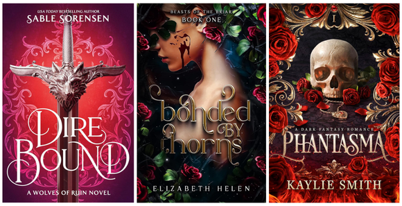
We can see this variety reflected in covers from Sable Sorensen, Elizabeth Helen, Kaylee Smith, Penn Cole, Tricia O’Malley, LJ Andrews, and more. Fonts that would work for this aesthetic would be:
- MORGIN ASTERA
- LE MAJOR
- CINZEL (commercial free)
- DESEVON
- YANA
- MUNNES
- GARTON (commercial free)
- ARCHANE
- RUSILLA SERIF
- FRONTEND
- MOON CREME
- ARCHES
HISTORICAL & GOTHIC FONTS
Here, we find fonts that harken back to bygone days. Inspired by ancient monuments, medieval manuscripts, Victorian typography, and gothic architecture, these fonts bring a sense of age, power, mystery, and history to a romantasy cover.
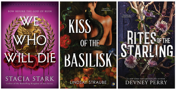
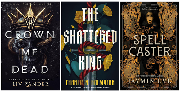
We can see this vibe reflected in covers from Stacia Stark, Lindsay Straube, Devney Perry, Liv Zander, Charlie N. Holmberg, and more. Fonts that work for this vibe are:
- EUR 42 (commercial free)
- MEDUSA GOTHIC
- COPPERPLATE CC (commercial free)
- FERRUM (commercial free)
- RISE OF KINGDOM (commercial free)
- MARCELLUS (commercial free)
- FORUM (commercial free)
- CASTELFORTE
- MOZES
- THORSA
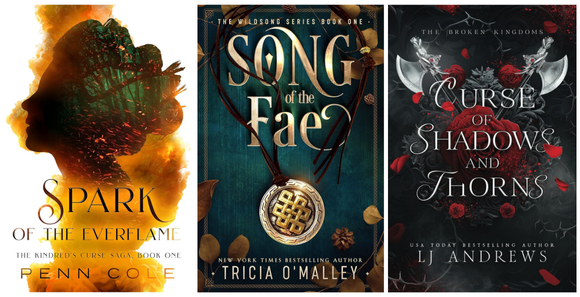
UNIQUE DISPLAY FONTS
Unique display fonts help a cover carve out its own identity and instantly stand apart in a crowded market. They often have unusual letterforms, dramatic ligatures, decorative details, handcrafted textures, or artistic quirks that make them feel memorable, even at thumbnail size.
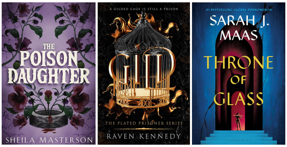
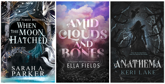
We can see this reflected in covers from Sheila Masterson, Raven Kennedy, Sarah J. Maas, Sarah A. Parker, Ella Fields, Keri Lake, and more. Fonts that would work for this aesthetic would be:
- DRAGON
- ARCANE FABLE
- YELLOW MAGICIAN
- THORN ANCIENT
- PRESS JOBS (commercial free)
- DRAGON FIRE
- ASTRID
- KRYLON
- SILVER MAGNUM
- SHANGRI LA
SANS SERIF FONTS
Departing from what’s “traditional” for fantasy, sans serif are the fonts you’ll find the least in the genre, but some bestsellers are definitely using them. Sans serifs bring a cleaner, sharper, and more modern feel to fantasy covers. Instead of leaning into ornate whimsy or historical influence, these fonts often create a confident and sophisticated edge.
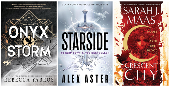
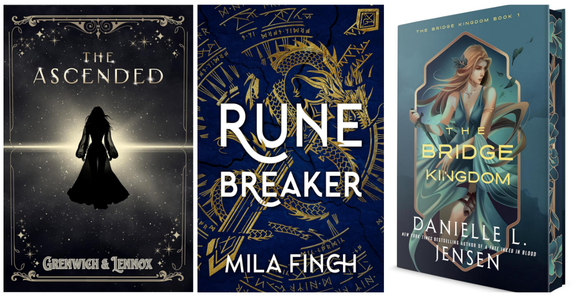
We can see this reflected in covers from Rebecca Yarros, Alex Aster, Sarah J. Maas, Greenwich & Lennox, Mila Finch, and Danielle L. Jensen. I was hard-pressed to find more than these, to be honest. Here’s some fonts that would work well if you’re going for this look:
- AURA
- LEAGUE GOTHIC (commercial free)
- BRISCA
- SALENA
- MONTREAL
- GO LONG (commercial free)
- MANSORY
- NAKED POWER (commercial free)
- ELVERA
- ROSEHOT (commercial free)
OLD STYLE SERIF FONTS
These are the classic serifs that might not make you turn your head, but allow the artwork on the cover to lure in readers and speak loudest vs the typography stealing the show. Old style serif fonts feel timeless, elegant, sophisticated, and deeply rooted in traditional publishing. Rather than capturing attention through dramatic flourishes or ornate decoration, they create trust, atmosphere, and polish. They carry echoes of old novels, mythology books, antique printmaking, and traditional fantasy publishing while still feeling clean enough for modern audiences.
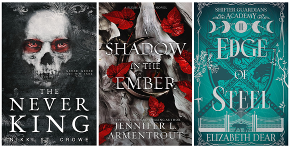
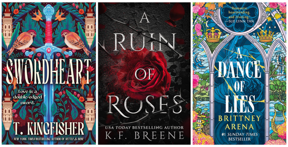
We can see this reflected in covers from Nikki St. Crowe, Jennifer L. Armentrout, Elizabeth Dear, T. Kingfisher, K.F. Breene, Brittney Arena, and more. Vintage serif fonts that would work are:
- QUIVIRA (commercial free)
- WENSLEY
- JUNICODE (commercial free)
- BASKERVVILLE (commercial free)
- EB GARAMOND (commercial free)
- MONTAGE
- CARDO (commercial free)
- INTERNATIONAL (commercial free)
- CAUDEX (commercial free)
- LIBRE BODONI (commercial free)
This is, of course, not every font used in romantasy throughout the years, but these are what’s gracing the top sellers at the moment. I hope it inspires you and your book’s branding / marketing materials!
And if you’re looking for a designer to help bring your romantasy cover to life, book with Wolfsparrow Covers.

Post by Teresa Conner
Teresa is a full-time freelance book cover designer and graphic designer for Wolfsparrow Covers. When not creating graphics or book covers for indie authors and traditional publishers, Teresa can be found writing erotic romance under her pen name Torrance Sené or fueling her addictions to tea, planners, and Marvel.


Maddie James
Great info Teresa! Thanks for posting. 🙂
Teresa
You’re welcome! Anytime I get to talk fonts, I’m happy!